


Ooookayyy, guys! So since the last journal I've been psyched to practice, and for the whole day I have. I found out some new things and I'm going to share them with you, the way I do my stuff and other cool stuff that may help you Digital Artists; (and possibly traditional artists)
1. Secret Keyboard Shortcuts
Ooooooohh! Spooky! Not, okay, let's get to it: Some of you people don't realize how useful and awesome keyboard shortcuts are, it's less time consuming and can like reduce the amount of time you spend on your artwork little by little
  (Wink)")
1) ...When adding details you can be editting in 2000% zoom, and still see the 100% canvas so you know what you're doing and how it looks like. You can create as many views as you want! So 2000%, 1000% or 50% whatever you want it's all there.
> Photoshop: Go to Window > Arrange > Create new
> Paint tool SAI: First you have to configure the key; go to Others > Keyboard Shortcuts then with any key just customize the shortcut with 'Create new view' which is under View.
2) ...Change the brush size
> Photoshop & Sai: This key ] will make the brush bigger and this key [ will make it smaller.
3) ...Switch foreground/background colours (or Primary and Secondary in SAI
> Photoshop & Sai: Press X! Super less time consuming
4) ...Lower/Highen opacity
With the brush selected, pressing any number: 1 2 3 4 5 6 7 8 9 0 will change the brush opacity. Say if you press 6 and 7 together it will beomce 67%. Sick, right?")
5) ...Zoom in/out at cursor position
Photoshop: Ctrl + + / Ctrl + -
Paint tool SAI: page up / page down
Or you can use your Tablet scroller wheel (if you have one)
or you can use your mouse scroller wheel.
6) ...The eyedropper tool To select colours on the canvas
Photoshop: Hold down Alt to use eyedropper, hold down Alt + Shift for Colour Sampler tool.
Paint tool SAI: Press I
7) ...Rotate Canvas
Paint tool SAI: Delete and End keys will rotate the canvas, this just rotates the view; not the actual picture.
Photoshop: I'm not sure how you can do it in Photoshop
8) ...Flip View Horizontally - This helps you to see any mistakes that you may have missed when drawing. Flipping the canvas horizontally really helps, try it sometime.
Photoshop: Edit > Transform > Flip Horinzontal
Paint tool SAI: Press H
9) ...Scaled re-sizing So that it doesn't go out of proportion when you re-size your art/something.
Photoshop & Paint tool SAI: Hold SHIFT while you do what you normally do; drag from the corners.
10) You can even customize your own, which is the best, really.
Photoshop: Ctrl + Shift + Alt + K
Paint tool SAI: Others > Keyboard Shortcuts
2) Paint tool SAI only: Scratch Pad This useful colour mixing or whatever you want to call it; function; is Paint tool SAI only. It's harder to blend in Photoshop, but super easy in SAI. Just go to Window > Scratchpad and viola! Go mess around with it, it saves whatever you paint there the next time you open SAI.
3)NEVER EVER Tips
1. Never use DODGE/BURN
Thank Paint tool SAI for not including that tool in their program, because really it's nothing, unless you're doing some realistic metallic reflection or post-processing or photoshopping, but even that it's not good. It'll ruin your picture. Besides, it'll turn your picture into Kawaii Desu really badly, I learnt that the hard way.
2. Never use BLUR TOOL for blending.
It's an awesome tool for other things, but don't use it for blending. I don't even know why people do suggest that because it'll ruin your strokes. To blend, just overlay two colours together like a hundred times in photoshop. In Paint tool SAI, just make your Blending option in the brush higher.
3. Never use BLACK LINE ART
Of course when you actually ink it, it's fine if it's black. Before you finish the outcome, make sure the lines are at least COLOURED or the picture is lineless because I learnt that the hard way too, of course it still looks nice but either two makes it look exceptionally better.
To colour lines: Make a clipping group above the line art layer; so make a new layer above the line art and press CTRL + G in Photoshop.
In Paint tool sai, there's an option called 'Clipping group' above the layers box. Tick that.
4. Never render your art in LESS THAN 300DPI
Why??? Because quality matters and you know it.
What is DPI anyway? It stands for Dots Per Inch and it does matter when you're printing, the larger the DPI the larger the print will be. 600 DPI is good enough for an A3, so 300DPI is good enough for an A4.
Lines always look better in 300DPI anyway, I used to colour in 72 DPI and that sucked ass, really.
You'll notice the difference if you do. To change it;
Photoshop: Image > Image Size > Resolution
Paint tool SAI: Canvas > Change Resolution
5. Never rush your work.
Yes, don't do it people. If you want your art to look nice, make it look good by spending time on it. If you're scared that it'll corrupt the file and then your computer will suddenly shut down (I remember that happened to me once), back up your file like every time you save or something. It doesn't happen often. But if you're working on an important file, then yes, do it.
3) COLOURING tips
1. Colouring does not look good if the lines aren't good. Enough said; and believe me it's true. Unless you're doing lineless, then it doesn't really matter.
 ")
2. Colour from DARK > LIGHT - I find it easier to compose your shades and lighting if you do. Before you start colouring always make sure you know what you're painting and what colour schemes you'll be using. You can always use a reference picture for the tints, then use the darkest tint and then on the same layer work up to the lightest, then if you're not satisfied with the outcome, keep going over it with the tints until you are. Don't blend with the blur tool or the smudge tool, it will kill your strokes.
3. Reflect lights! Use them! Those are the little stroke of light that reflects from other objects in the picture. It gives more depth. Say if theres light from the back, then use a 1 px brush and go around the edge of the persons face with a light brush so that there's a line there.
Reflect lights are everywhere.
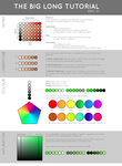
4. DOOOOOOOO NOOOOOTTT ! When picking colours don't work your way from the top of the wheel to the bottom of the colour wheel because it'll make your picture down right DULL.
The red arrow shows the way that makes your colours dull. use colours that compliment each other and that's on the opposite side of the wheel or around it. Green compliments pink / yellow / blue / any other colour apart from dark green, dark green and dark green again.

What you do is go with dark green -> then lighter green -> add yellow -> compliment with blue or pink or purple or red etc.
it depends on the atmosphere in the picture. ^.^
5. Take your time; Don't rush your picture. If you do, it will really suck and believe me it really will suck.
4) DRAWING tips
These are some of the tips I've learnt today
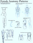
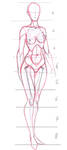
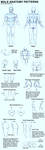
1. REFERNENCE. Oh please do. Use as many real life references as you can. Study and analyze the picture. Where the weight is pressured on, where the action line is, where the tilt of the body goes and such and such.
2. START WITH A BASIC CONCEPT = Don't just start drawing the image you have in your head. Go with some basic shapes or lines and then go on from there. Details come last, of course.
3. PRACTICE/DOODLE EVERYDAY. oh, you'll get better. use tutorials/references, just doodle and sketch sketch in a paper or book or anything.
4. LINE ART must not be sketchy. Line arts do effect how you colour, unless it's lineless. Do quick strokes because slow strokes are wobbly. When you place a sketch and you're line arting - Lower the sketch layer opacity to less than 30% or depending on how light you want it so that you can see your actual line art better.
5. Don't rush. Please don't rush.
Hope it helps! There are many more tips I can share, but waaay too much to list, so if you have anything specific you want to ask, I might know, but don't ask me all those super-pro questions like how does paint, okay? Also if you have anything to share, go ahead and comment I'll add it in.
And be patient; and music helps.
1. Secret Keyboard Shortcuts
Ooooooohh! Spooky!
1) ...When adding details you can be editting in 2000% zoom, and still see the 100% canvas so you know what you're doing and how it looks like. You can create as many views as you want! So 2000%, 1000% or 50% whatever you want it's all there.
> Photoshop: Go to Window > Arrange > Create new
> Paint tool SAI: First you have to configure the key; go to Others > Keyboard Shortcuts then with any key just customize the shortcut with 'Create new view' which is under View.
2) ...Change the brush size
> Photoshop & Sai: This key ] will make the brush bigger and this key [ will make it smaller.
3) ...Switch foreground/background colours (or Primary and Secondary in SAI
> Photoshop & Sai: Press X! Super less time consuming
4) ...Lower/Highen opacity
With the brush selected, pressing any number: 1 2 3 4 5 6 7 8 9 0 will change the brush opacity. Say if you press 6 and 7 together it will beomce 67%. Sick, right?
5) ...Zoom in/out at cursor position
Photoshop: Ctrl + + / Ctrl + -
Paint tool SAI: page up / page down
Or you can use your Tablet scroller wheel (if you have one)
or you can use your mouse scroller wheel.
6) ...The eyedropper tool To select colours on the canvas
Photoshop: Hold down Alt to use eyedropper, hold down Alt + Shift for Colour Sampler tool.
Paint tool SAI: Press I
7) ...Rotate Canvas
Paint tool SAI: Delete and End keys will rotate the canvas, this just rotates the view; not the actual picture.
Photoshop: I'm not sure how you can do it in Photoshop
8) ...Flip View Horizontally - This helps you to see any mistakes that you may have missed when drawing. Flipping the canvas horizontally really helps, try it sometime.
Photoshop: Edit > Transform > Flip Horinzontal
Paint tool SAI: Press H
9) ...Scaled re-sizing So that it doesn't go out of proportion when you re-size your art/something.
Photoshop & Paint tool SAI: Hold SHIFT while you do what you normally do; drag from the corners.
10) You can even customize your own, which is the best, really.
Photoshop: Ctrl + Shift + Alt + K
Paint tool SAI: Others > Keyboard Shortcuts
2) Paint tool SAI only: Scratch Pad This useful colour mixing or whatever you want to call it; function; is Paint tool SAI only. It's harder to blend in Photoshop, but super easy in SAI. Just go to Window > Scratchpad and viola! Go mess around with it, it saves whatever you paint there the next time you open SAI.
3)NEVER EVER Tips
1. Never use DODGE/BURN
Thank Paint tool SAI for not including that tool in their program, because really it's nothing, unless you're doing some realistic metallic reflection or post-processing or photoshopping, but even that it's not good. It'll ruin your picture. Besides, it'll turn your picture into Kawaii Desu really badly, I learnt that the hard way.
2. Never use BLUR TOOL for blending.
It's an awesome tool for other things, but don't use it for blending. I don't even know why people do suggest that because it'll ruin your strokes. To blend, just overlay two colours together like a hundred times in photoshop. In Paint tool SAI, just make your Blending option in the brush higher.
3. Never use BLACK LINE ART
Of course when you actually ink it, it's fine if it's black. Before you finish the outcome, make sure the lines are at least COLOURED or the picture is lineless because I learnt that the hard way too, of course it still looks nice but either two makes it look exceptionally better.
To colour lines: Make a clipping group above the line art layer; so make a new layer above the line art and press CTRL + G in Photoshop.
In Paint tool sai, there's an option called 'Clipping group' above the layers box. Tick that.
4. Never render your art in LESS THAN 300DPI
Why??? Because quality matters and you know it.
What is DPI anyway? It stands for Dots Per Inch and it does matter when you're printing, the larger the DPI the larger the print will be. 600 DPI is good enough for an A3, so 300DPI is good enough for an A4.
Lines always look better in 300DPI anyway, I used to colour in 72 DPI and that sucked ass, really.
You'll notice the difference if you do. To change it;
Photoshop: Image > Image Size > Resolution
Paint tool SAI: Canvas > Change Resolution
5. Never rush your work.
Yes, don't do it people. If you want your art to look nice, make it look good by spending time on it. If you're scared that it'll corrupt the file and then your computer will suddenly shut down (I remember that happened to me once), back up your file like every time you save or something.
3) COLOURING tips
1. Colouring does not look good if the lines aren't good. Enough said; and believe me it's true.
2. Colour from DARK > LIGHT - I find it easier to compose your shades and lighting if you do. Before you start colouring always make sure you know what you're painting and what colour schemes you'll be using. You can always use a reference picture for the tints, then use the darkest tint and then on the same layer work up to the lightest, then if you're not satisfied with the outcome, keep going over it with the tints until you are. Don't blend with the blur tool or the smudge tool, it will kill your strokes.
3. Reflect lights! Use them! Those are the little stroke of light that reflects from other objects in the picture. It gives more depth. Say if theres light from the back, then use a 1 px brush and go around the edge of the persons face with a light brush so that there's a line there.
Reflect lights are everywhere.
4. DOOOOOOOO NOOOOOTTT ! When picking colours don't work your way from the top of the wheel to the bottom of the colour wheel because it'll make your picture down right DULL.
The red arrow shows the way that makes your colours dull. use colours that compliment each other and that's on the opposite side of the wheel or around it. Green compliments pink / yellow / blue / any other colour apart from dark green, dark green and dark green again.
What you do is go with dark green -> then lighter green -> add yellow -> compliment with blue or pink or purple or red etc.
it depends on the atmosphere in the picture. ^.^
5. Take your time; Don't rush your picture.
4) DRAWING tips
These are some of the tips I've learnt today
1. REFERNENCE. Oh please do. Use as many real life references as you can. Study and analyze the picture. Where the weight is pressured on, where the action line is, where the tilt of the body goes and such and such.
2. START WITH A BASIC CONCEPT = Don't just start drawing the image you have in your head. Go with some basic shapes or lines and then go on from there. Details come last, of course.
3. PRACTICE/DOODLE EVERYDAY. oh, you'll get better. use tutorials/references, just doodle and sketch sketch in a paper or book or anything.
4. LINE ART must not be sketchy. Line arts do effect how you colour, unless it's lineless. Do quick strokes because slow strokes are wobbly. When you place a sketch and you're line arting - Lower the sketch layer opacity to less than 30% or depending on how light you want it so that you can see your actual line art better.
5. Don't rush. Please don't rush.
Resources
This artist is amazing when it comes to tips for drawing Give her a visit ^^
- Real life photos
- Never use anime if you want to improve anatomy
This artist is amazing when it comes to tips for drawing
Give her a visit ^^- Real life photos
- Never use anime if you want to improve anatomy
Hope it helps! There are many more tips I can share, but waaay too much to list, so if you have anything specific you want to ask, I might know, but don't ask me all those super-pro questions like how does
paint, okay? And be patient; and music helps.


an unbreakable connection.